


Identifying how much shade exists at each of the 5,098 bus stops in Detroit might seem an unlikely pursuit for a researcher in Los Angeles. But for Dr. V. Kelly Turner, associate director of the UCLA Luskin Center for Innovation, that interest starts with realizing that shade is essential in a world of dangerously hot days. And shade is in very short supply.
In fact, some 90% of Detroit’s bus stops are virtually unprotected by shade, a fact that should be of interest to any Detroit politician looking out for constituents, given that 85,000 daily transit riders brave more dangerously hot days at those unshaded stops.
“I’m always interested in how we can take science and meet the needs of real-world situations,” Turner told Blueprint. Given that many mass-transit riders are low-income, she added, “We can learn a lot about heat exposure in different vulnerable populations and where we might want to intervene.”
Turner spent a year working on a project to accomplish that aim — not just in Detroit but across the United States. In June, the Luskin Center for Innovation, in partnership with the Washington, D.C.-based nonprofit American Forests, released the Shade Map. The online tool identifies how much shade is available in 360 U.S. cities and towns, broken down by Census tract. Punch in an address and the map shows not only how much shade is cast but what proportion is provided by buildings and what comes from trees.
The map also shows how shade cover changes during the day; there are measurements at noon, when the sun is at its highest point, meaning the least shade is cast, and then at 3 and 6 p.m., when the angle of the sun is lower, producing more shade.
The map lands as climate change is wreaking its well-chronicled havoc, and not only with melting glaciers and more destructive hurricanes. The Shade Map team points out that extreme heat contributes to an estimated 12,000 premature deaths in the country each year.
“Some research says that could increase eight-fold by the turn of the century,” said Chris David, a vice president at American Forests who helped create the Shade Map. “We could be losing 100,000 lives by 2100 if we don’t do something about it. And trees and shade are a critical part of that solution.”
Turner, who is also an associate professor of urban planning and geography, has long worked at the intersection of heat and policy. For the Shade Map, which was funded by the Robert Wood Johnson Foundation, she turned to a past collaborator at American Forests.
Tree Equity
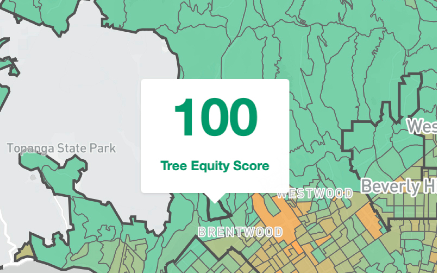
It was a natural fit, given that in 2021 American Forests had released its Tree Equity Score. The web-based tool features a green-flecked map of the United States that uses data points such as tree canopy, building density, race, and income and employment to provide local scores of 0 to 100 and, in the process, determine which neighborhoods are underserved. As the Tree Equity website states, “The lower the score, the greater the need for investment.”
The Shade Map is a clickable layer in the Tree Equity Score. Turner and her team assembled huge volumes of shade data, with levels recorded throughout the country on June 21, the summer solstice. David, who specializes in presenting data in visually compelling, easily understandable ways, incorporated the information into the American Forests system.
The project includes three immersive, geographic “stories” that build on the data — that’s where the information on bus stops in Detroit comes into play. Users can click and zoom to see which stops in the city have shade and which don’t. Another deep dive explores shade at parks in Phoenix. A third focuses on routes to school in Austin, Texas, revealing which paths leave students trekking in the most sun.
“That one is fun because it was developed as an interactive tool that kids could use,” Turner says.
The Shade Map team points to the things everyone instinctively knows and responds to: Shade is a natural coolant, and when walking on hot days, we all cross to the side of the street with more cover, particularly if it comes from leafy trees. As Turner said in a June webinar unveiling the map, “Shade literally lowers the metabolic rate your body needs to do a certain activity.”
The research fills in lesser-known details. Of the 360 cities analyzed, 202 have less than 25% shade coverage at noon. Then there’s the nature of shade itself: Any vertical object casts shade, but due to their canopies, trees provide 25 times more shade at 12 p.m. than do buildings, making them preferable (and cheaper) shade solutions. As the day goes on, the percentage of total shade provided by buildings increases.
The report also explores “shade equity.” It may not come as a surprise that affluent areas have more trees than poor ones, but the disparity can be astronomical. The research shows that in Detroit, the Census tract with the most shade at 6 p.m. has 80% coverage. The area with the lowest level has 6%, meaning the city has a “shade gap” of 74%. The gap is even wider in Austin.
Levels in Los Angeles are also striking. The Shade Map shows that at 3 p.m., some tracts in Westwood have coverage of 50% or higher. Many residential parts of Pasadena surpass 60%. Numerous Brentwood tracts exceed 70%.
At the same time of day, many portions of South Los Angeles are below 25% coverage. Levels in Carson are often under 20%. Some tracts in Pico Rivera come in under 15%.
“There are some cities, L.A. among them, where there’s a huge difference between the shadiest and least shady area,” Turner said. “What cities can do to try to address the equity issue is say, OK, here are the areas of the city where we don’t have shade, and we know there’s a vulnerable or a sensitive group. Let’s target those areas for intervention first, because that’s where the shade’s needed most.”
Using the map
When using the Shade Map, it’s easy to fall down a rabbit hole. I did what most people will do first: looked up my address and learned that my Census tract has 25% shade at noon, with 1% cast by buildings and 24% from trees. The coverage level goes to 67% at 6 p.m. (33% from buildings, 34% from trees).
Then I looked at places where I formerly lived, followed by relatives’ addresses. From there it was landmarks across the country, including Madison Square Garden (84% shade coverage at 6 p.m., with 80% from buildings), and Graceland (66% shade at 6 p.m., about two-thirds cast by trees).
The impacts of climate change heighten the importance of knowing where shade is lacking (the Shade Map allows users to download, for free, the information in geospatial or spreadsheet form). Turner remarks that as cities experience more dangerously hot days, there is reason to shift from focusing on heat “survivability” to responses that address “livability.” As an example, she points to a schoolyard, noting that it’s unsafe for kids to play on the blacktop if it’s triple digits for weeks on end and there’s no shade. Providing coverage makes it, if not comfortable, at least usable. “I see this as basically extending our ability to be outside even when it’s hot,” she said.
The Shade Map builds on this point by revealing where “shade deserts” exist. Again, this often means lower-income neighborhoods (though there can be “shade oases” in these communities).
“The basic idea,” said Turner, “is if we democratize shade data, then advocates can advocate for it, and policy makers can make decisions around it.”
Those decision makers include Marta Segura, who serves as both Chief Heat Officer in the city of Los Angeles and director of the Climate Emergency Mobilization Office. She is tasked with all manner of mitigating heat in the city. Her office is currently putting together L.A.’s first heat action and resilience plan.
Segura praises the Shade Map, specifically mentioning the ability to pinpoint the shade deserts and the guidance that offers policy makers.
“That’s important, because with the minimal investments that we have at this time, we have to prioritize areas that need it the most,” she said.
The data’s utility is far-reaching, she added. Planners might look at tree planting, while a street services department could use the information to determine where bus shelters rise. Once planted, trees need ongoing maintenance and watering, so the map could guide maintenance work. And the map allows departments to assemble evidence and seek grants for that longer-term attention.
It’s not only city officials who can utilize the information. Residents who discover that their neighborhood has fewer trees than other areas have a fact-based launch point for advocacy.
There are also opportunities for community-based nonprofits.
“We work with a lot of local tree-planting organizations across the country,” David says. “This is a tool ready-built for them to be able to home in on where they can get investments to support the increase of tree-canopy cover in their communities.”
The Shade Map is just one tool in the climate-change era, and some cities are further along than others. Phoenix has been on the front end of addressing shade. In Los Angeles, in addition to Segura’s office, there is the new organization Shade L.A. (led by the USC Dornsife Public Exchange, with collaboration from the UCLA Luskin Center for Innovation and other entities). They will play a role as the 2028 Olympics approaches, and with it the need to keep athletes and spectators cool.
For smaller cities and towns, the Shade Map may be a starting point. Turner notes that it will provide data they were lacking, and they get it without spending a dime.
Segura mentions another benefit in these heated times: As the impacts of climate change become more severe, so does what she terms “competing products out there for the urban heat island.” In short, different people are trying different things in different places, often based on different sources of information. The Shade Map, she said, could help direct resources to the areas that most need it.
“When we have actual data and information on what the best investments are for cities with limited resources, then we can make better decisions, rather than focusing on something that’s experimental, that’s a pilot, that can have unintended consequences and be a waste of resources,” Segura says. “So research like this can save big and small cities a lot of money and avoid false solutions.”
Which is important, because it’s hot out there.